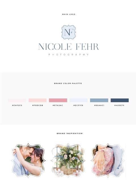

Do you get stuck in the cycle of trying too hard to find the perfect font and pair it with your template? And you find yourself spending way too much time trying to decide? If so, you might find this blog post extremely helpful, as I will share my favorite font pairing and how I don’t spend too much time “overthinking” fonts. But before we dive in, let’s chat about combining fonts for a website with these five quick tips to keep in mind:
1. Consider the goal, purpose, and aesthetic of the website:
The fonts you choose should match the tone and purpose of the website. For example, a website for a doctor would more than likely use different fonts than a website for a kids fun zone.
2. Choose fonts that complement each other:
Fonts should look like they blend together well. They should not look like they are competing for attention.
3. Limit the number of fonts used:
Stick to using two or three fonts maximum. Using too many fonts can make a website look cluttered and unprofessional. Not to mention hard for the reader to read.
4. Test the fonts on different devices:
Some fonts are hard to read on mobile vs, let’s say desktop so it’s essential to make sure the fonts are legible on all devices, such as desktops, laptops, tablets, and mobile phones.
5. Use fonts with contrasting styles:
Choosing fonts with different weights, sizes, and styles is important. You can pair a bold font with a thin font, or a serif font with a sans-serif font.
My Top Five Website Font Pick Combination for Building Showit Templates and Why

- Playfair Display & Nato Sans
The two combinations of Playfair Display and Nato Sans is my number one go to font combo. It is so universal because it goes with many styles of design as well as the use of using Playfair in all caps, italic and bold. This allows you to create headings that have important words stand out.

2. Italiana Normal and Montserrat Light
This blend of font pairing works very well with many styles such as light and airy, tones of pastel and soft brands but yet will also work for professional and simple styles.

3. DM Serif Display and Raleway Normal
If you want bold DM Sherif Display is sure to not disappoint and you could pair it with a lot of other fonts but I personally find Raleway to work well on mobile and all other sizes so it is my go to.

4. Oswald Normal and Josefin Sans Normal
There is just something about these two fonts that draws me in. I personally love how Oswald is clean and bold but yet simple and stands out. I love to pair it with Josefin Sans to get that feel of geometric shape it has and it could be elegant, with a vintage feel.

5. Didot Normal and Open Sans Normal
This combo is my go to for wedding websites as it does provide a clean yet beautiful elegance to any website as well as being very easy to read.
And there you have it five of my favorite go to font combinations for building website templates.